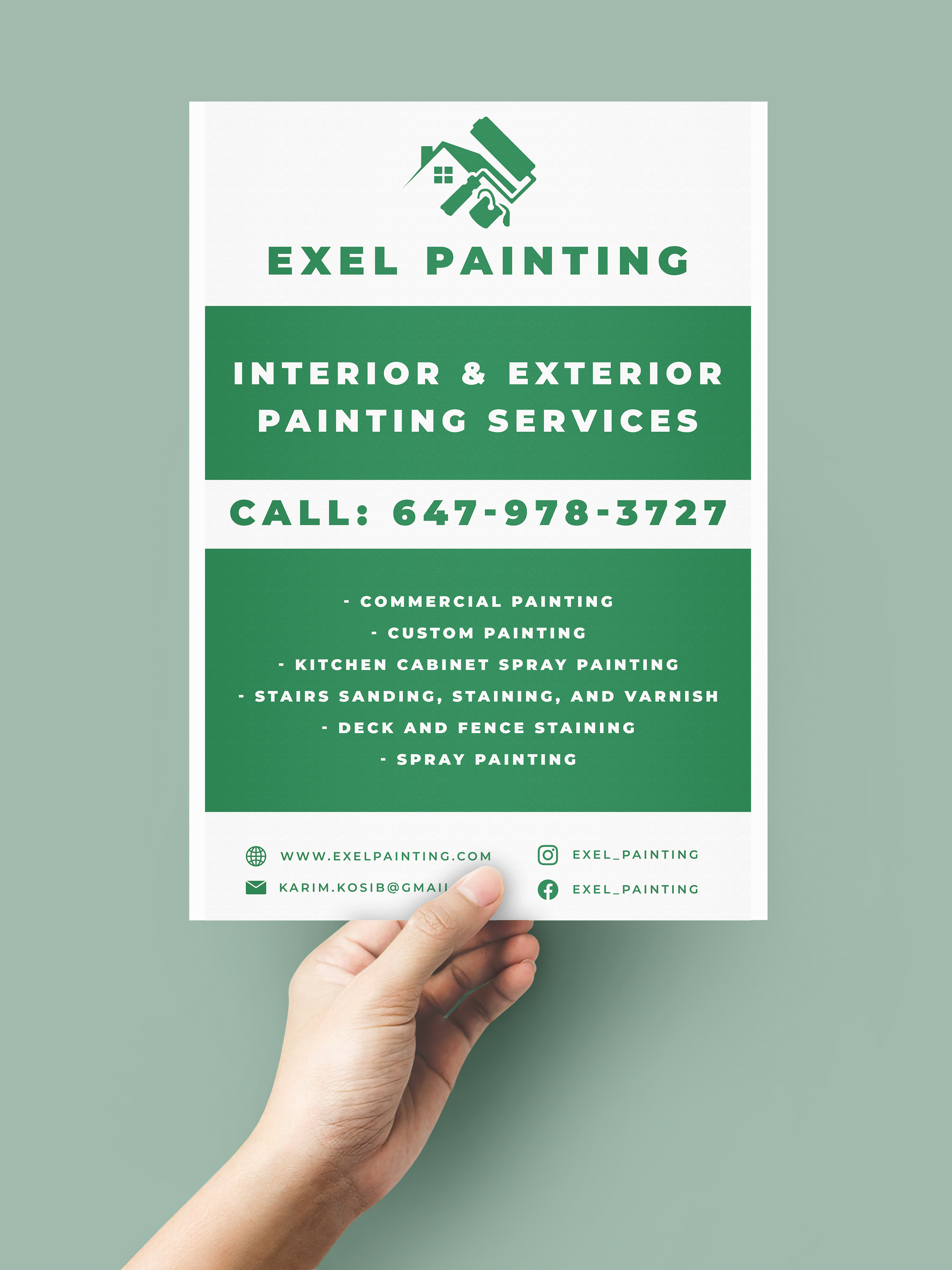
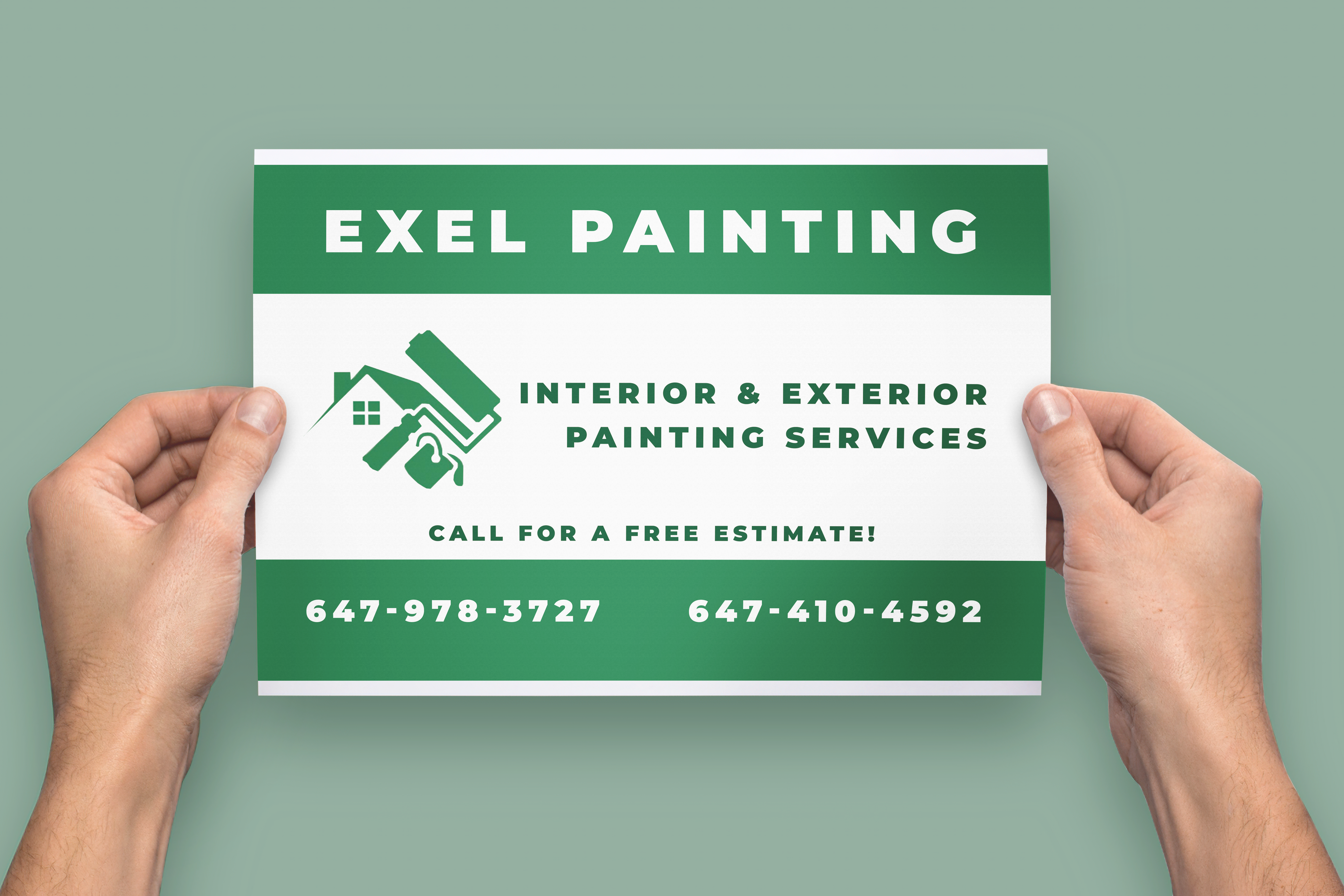
Request: Poster advertising the services offered. Clear, focus on
legibility. Match logo colour.
Decided to use simple bold font with extra letter spacing to make sure
text was readable from far. Since client wanted 2 different sizes,
I inverted the use of border colours for diversity. I kept the layout
simple and clear with lots of whitespace. One poster was to be used
as an overall ad while the other could have more information about services
so I made sure the portrait poster had the service information since the layout
allowed for more text.
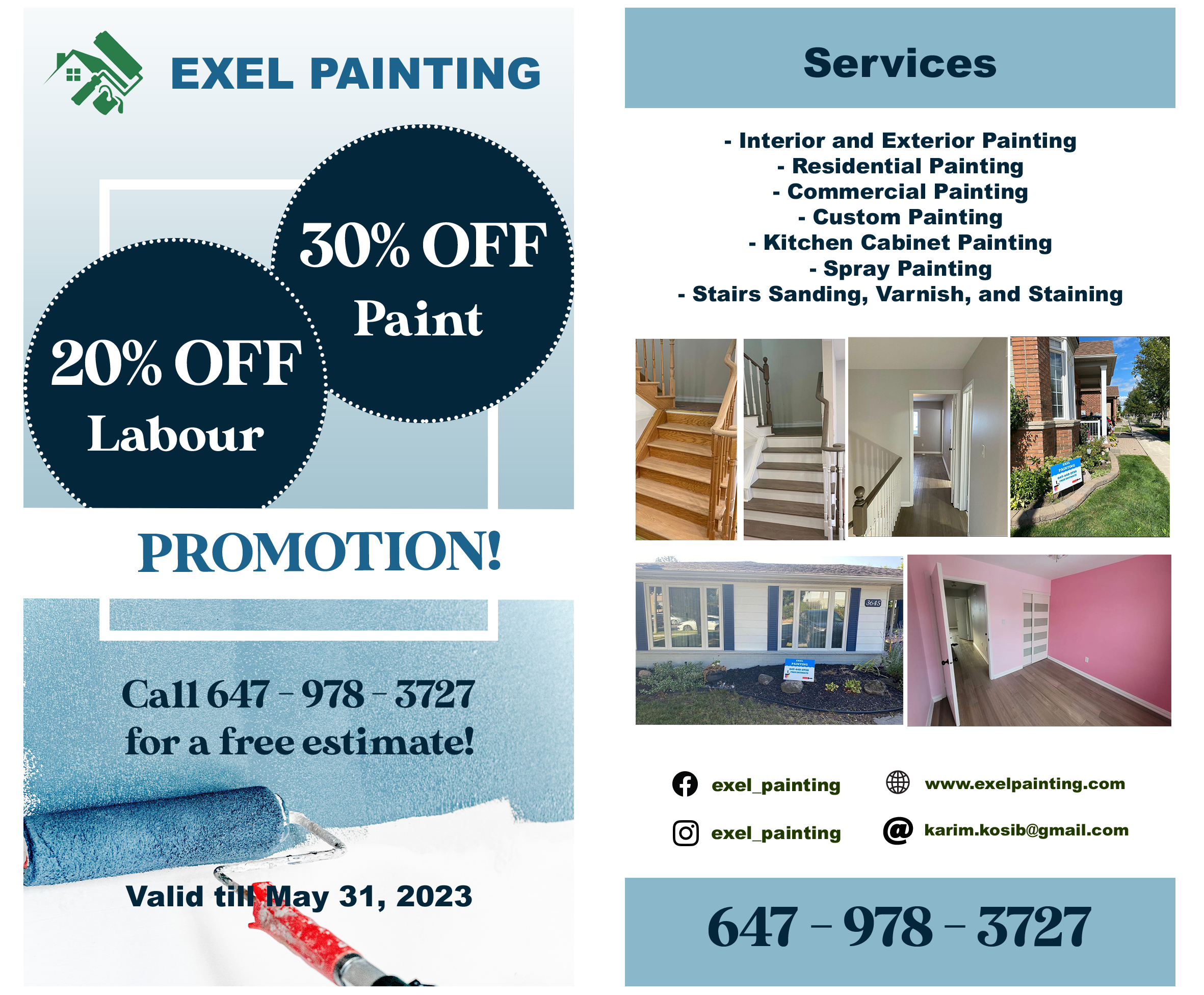
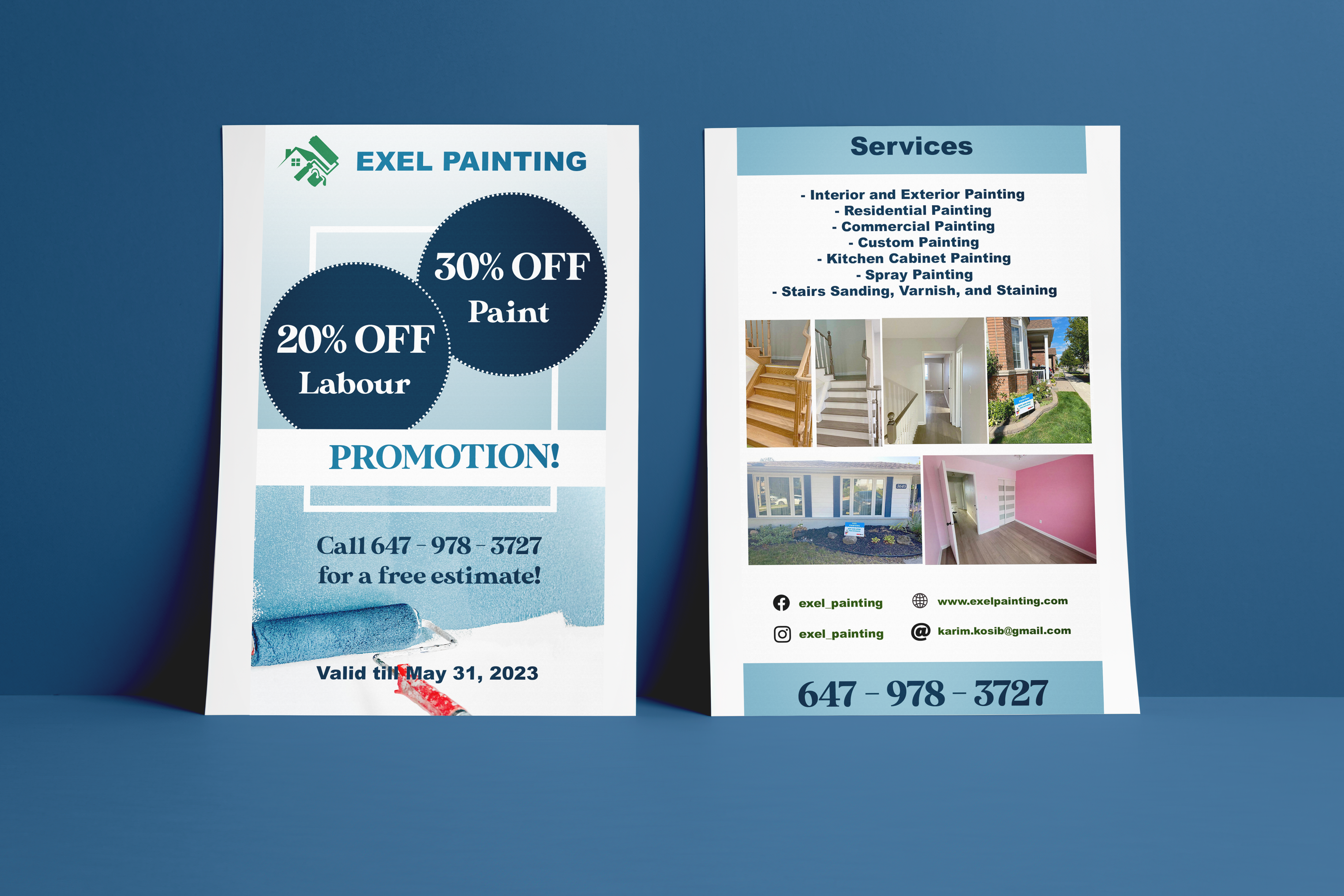
Request: Double sided sale flyer. Include the promotion and call-to-action
as main focus. Also include all services provided as well as social media and
images of past work.
I decided to not use the same green as their logo this time. I used
different shapes to add interest and used old-school type shapes for
the sale information. I also decided to use a stock image of paint rollers
to make up the background. For the second side of the flyer I edited
and arranged the images based on size and orientation to keep it balanced.
I placed them in the middle to separate all the text about the services and the socials.
I kept the use of colour monochromatic to keep all attention to the information and to not clash
with the images.