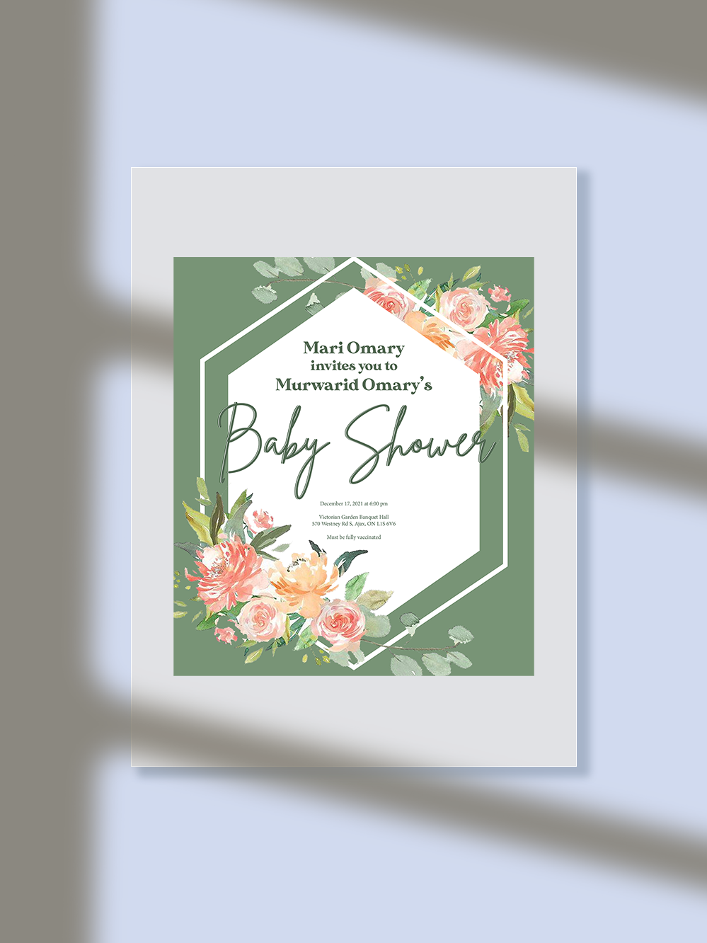
Request: A design with geometric shapes and lots of flowers.
Lots of colours but still looks cohesive.
New mother's favourite colour is green and she likes feminine designs.
Project took approximately 1.5 weeks with 2 changes.
I decided to use green as the main colour and surround it with watercolour flowers.
Client was not a fan of minimalism but did not want it to look crowded or messy.
The geometric shapes and the thin script font helped against the minimalist look while
keeping everything clean. I chose a a fun rounded font to give the design a soft feminine
look and to contrast against the sharp geometric shapes. The flowers also have some soft
edges to give the feminine feel. In order for the sharp shapes to not be out of place, I made
sure the font was a serif font and the flowers have sharp edges mixed with the soft ones.
Varying the sizes of the design elements and choosing colours with similar saturation let me
bring everything together with enough white space to make the design full but not crowded just as the client wanted.